
What makes a theme, a theme?
Is it the choice of fonts? The colors? What you find in the header or footer? What you find in between the header and footer?
We’ve been essentially using themes as a quick starting point for a website. If you, for example, apply the Altitude theme and import its theme data you end up with what you see on theme-altitude.ecpbuilder.com. But what happens when you starting customizing the colors, fonts, homepage content, headers, footers, etc as most people do? What happens when you decide you like the homepage content from EyeOne better but want to keep the header and footer from Altitude? You now still technically have the Altitude theme applied, but what exactly makes it Altitude?
One good reason for our different themes is our inability to modify the headers and footers. The themes have a prebuilt arrangement that you can only modify in a minor way. For example the logo area is a specific width, the main navigation may be below the site logo or to the right of it, there may be different allocated areas for header/toolbar content, certain colors are used, etc. What if you can solve this issue by using the Page Builder to build your headers and footers? If you can customize the headers and footers to your liking, and add that to our existing ability to customize the fonts/colors/homepage content, etc, there is no longer a need for multiple themes. You have one theme that can become anything. That theme is Flex.
With the headers/footers in the Page Builder a number issues we routinely experience simply go away. Have you ever needed to:
- Make the logo bigger/smaller?
- Add a background color to the header?
- Rearrange the header layout to support different column layouts?
- Create a toolbar and place items in different columns?
- Use BigBang’s header overlap feature, but only on some pages?
- Have the ability to use a different logo when the header is overlapping, for example you may want a white logo when it’s overlapping but the standard logo when it isn’t.
- Use a completely different header for some pages?
- Have a multicolumn footer layout without requiring a mess of shortcodes
- Not have to deal with shortcodes…ever?
The last missing piece of the puzzle is being able to quickly start a website with a prebuilt layout, something the old multiple theme setup plus the import theme data feature excelled at. We have an answer for that too, there is now a library of header, footer, and homepage content options you can select from in the Page Builder, nothing needs to be built from scratch.
Your workflow now changes. You no longer pick a specific theme because it has more aspects you like than dislike with the expectation you’ll choose that theme and then and add the missing pieces later. You instead start with Flex and choose the header, homepage content, and footer you like. If at a later date someone decides they want a different header there’s no longer a question of whether you should switch themes and deal with the aftermath or try to hack the change with custom CSS. You just edit the header layout and insert a new prebuilt header layout.
How to use Flex
Editing a Page Builder template
Flex works on the principle of building Page Builder pages that can be inserted anywhere, be it in the header widget region, footer widget region, or anywhere really. These Page Builder pages are called Templates. You can see your current list of templates by navigating to “My Content > Templates”. You edit a template in the same manner as you’d edit any other Page Builder enabled page.
Assigning a template to a widget region
Once you have a template you can assign it to a widget region from the Widgets screen (Appearance > Widgets). This process isn’t much different than dragging any other widget into a widget region. There is a header/footer widget region and a new “Template” widget to drag into these regions. Once you drag the Template widget into the region you select from the available templates to insert into that region.
Template Library
We have created a global library of headers, footers, and landing pages. Everything you find in our library has been tested for mobile and is ADA compliant. If there’s a layout you use often and would like it added to the library just let me know! The goal is to amass a library large enough so you are never building anything from scratch.
Header Modes
Inline Mode
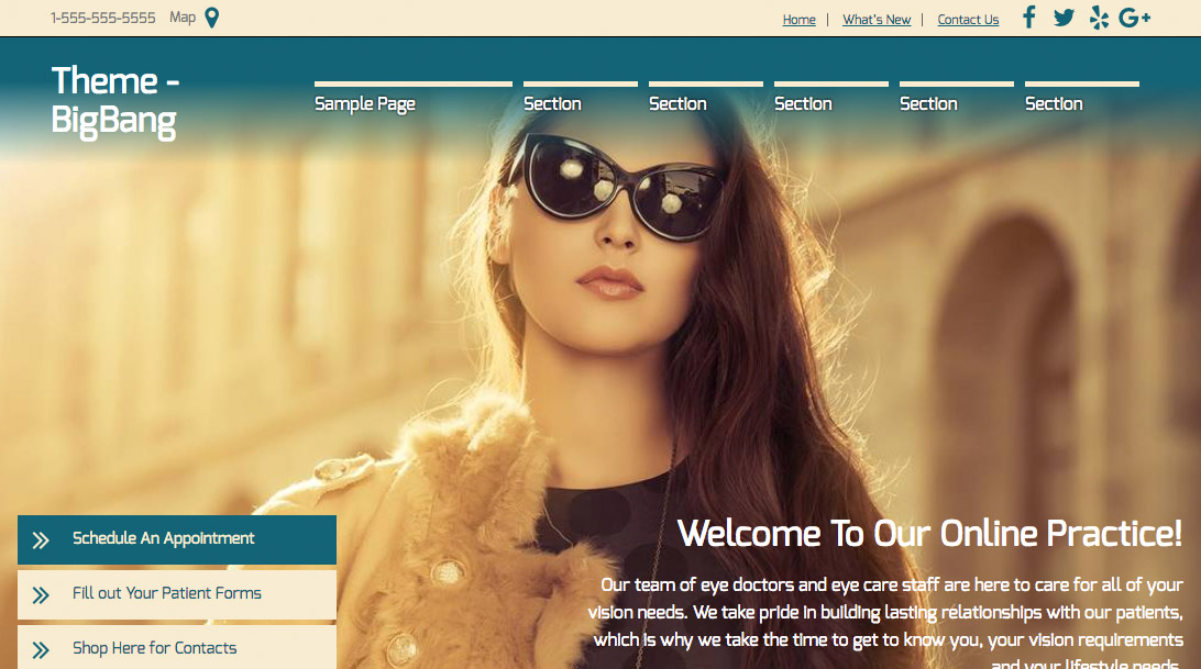 Overlap Mode
While using Flex you may notice a new option in Page Options > General. The option is called “Header Mode”. The Header Mode allows you to apply different effects to the header. The available effects are:
- Inline – This is the default mode of the headers. No effect is applied to the header.
- Inline-Sticky – When this mode is enabled, the header appears as it normally would until you begin to scroll down, at which point it will follow you as you scroll down the page.
- Overlap – When this mode is enabled the header will overlap the content. This mode works best when the top of the page has a large image to overlap.
- Overlap-Sticky – When this mode is enabled the header will overlap the content and as you scroll down the header will follow you.
It’s important to note that applying the overlap/sticky mode has no other effect on the header other than its placement. This mode will not, for example, alter the text color or add a background color gradient (as per BigBang). The reason for this is we have no way of knowing what colors to use, for example if you are overlapping the header over a light colored image you may want to leave the navigation its standard black color as light text on a light background won’t be legible.
With the different header modes you are likely going to want to customize how the header looks in each mode. For example in sticky mode you’ll likely want to reduce the height of the header and perhaps give the header a background color, in overlap mode you way want to color the nav text white and swap out a white logo. To accomplish this you will edit your header in the Page Builder, and then duplicate that row. Assuming you want the first row to be the ‘inline’ mode row you’d customize it for that mode as you see fit. Assuming you want the second row to be the ‘sticky’ mode row you’d customize it for that mode as you see fit. The trick is then to show/hide the rows depending on which mode is enabled and that’s accomplished by adding a few special classes to the row-
- header-hide-when-inline
- header-hide-when-overlap
- header-hide-when-sticky
The classes behave as they are named. In the example above, if the first row you only want displayed on ‘inline’ mode you’d add a ‘header-hide-when-sticky’ class to that row. If your second row is only to be used on ‘sticky’ mode you’d add a ‘header-hide-when-inline’ class to that row.
Menu Module
The new theme makes use of the menu module, a highly configurable module that allows you to tweak nearly any aspect of the menu. Menus created with the menu module are automatically mobile-friendly and support a few variations of the mobile layout- hamburger menu, dropdown, or a vertical list.
Badges
Our older themes had different badge designs, if you’re going to have one theme to rule them all you’ll need a way to customize how a badge looks. You can now tweak nearly any aspect of the badges or forgo the badges entered in Site Options and add your own.